Lead Product Designer | B2B SaaS Dashboard + Reporting UX
Challenge
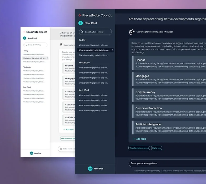
FiscalNote, a policy tracking platform, brought me on to lead a critical reporting redesign that had stalled after multiple handoffs. The feature allows clients to share legislative insights and actions with stakeholders via custom reports. With unclear goals, limited direction, and a high volume of data to sort through, the team needed someone who could work independently and bring strategic focus to a high-visibility initiative.
Role & Contribution
I was responsible for defining the vision, aligning cross-functional teams, and delivering a streamlined, scalable, and data-rich reporting experience. My work spanned product strategy, data curation, user research, UX/UI design, and close collaboration with engineering and leadership.
Discovery & Strategy
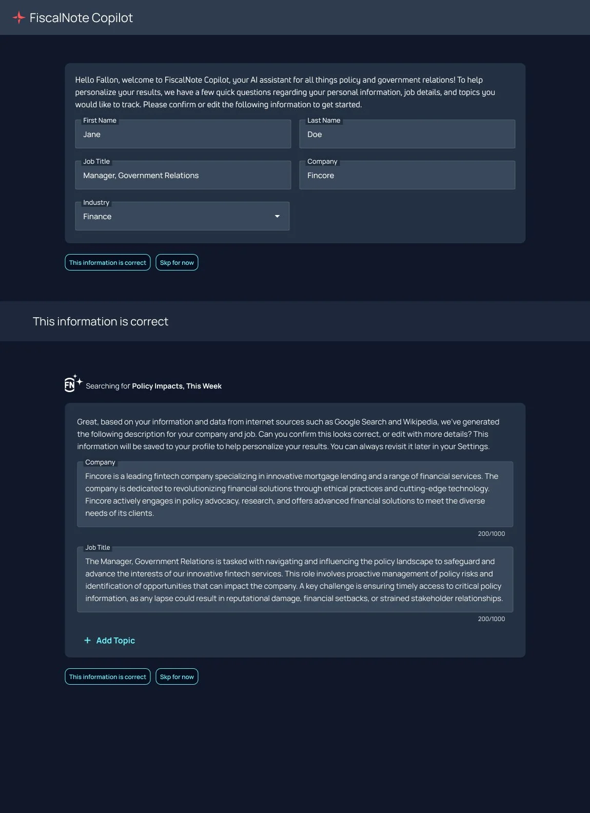
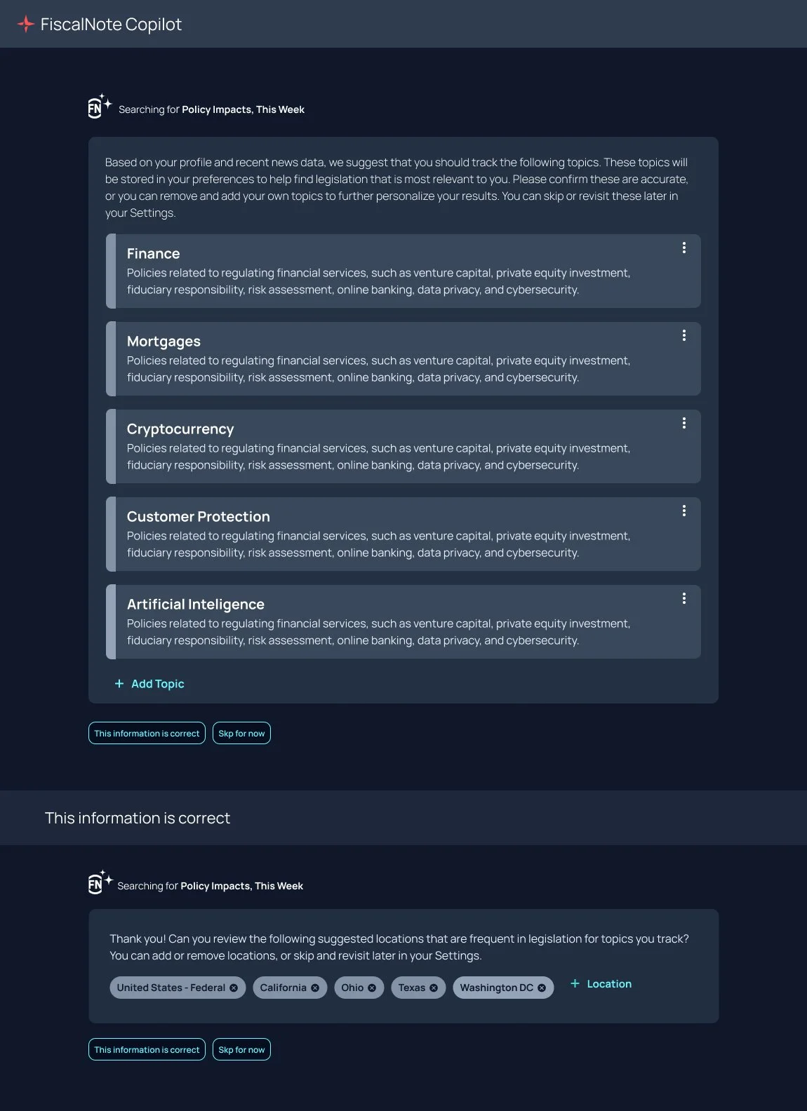
•Partnered with research to synthesize client pain points and reporting needs
• Conducted interviews with account managers and support teams to identify frequent reporting gaps
• Audited existing data sources and report templates to identify areas for simplification and improvement
Design & Execution
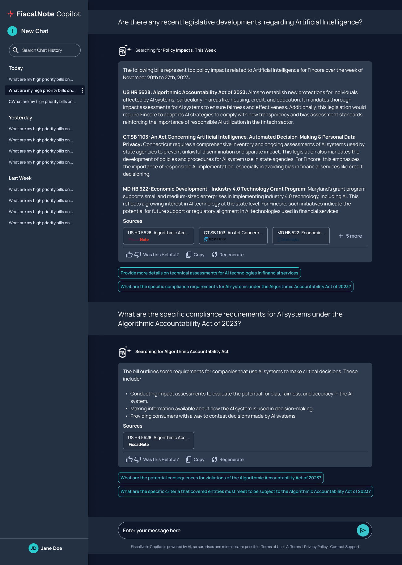
• Defined the MVP and long-term vision for a flexible reporting system
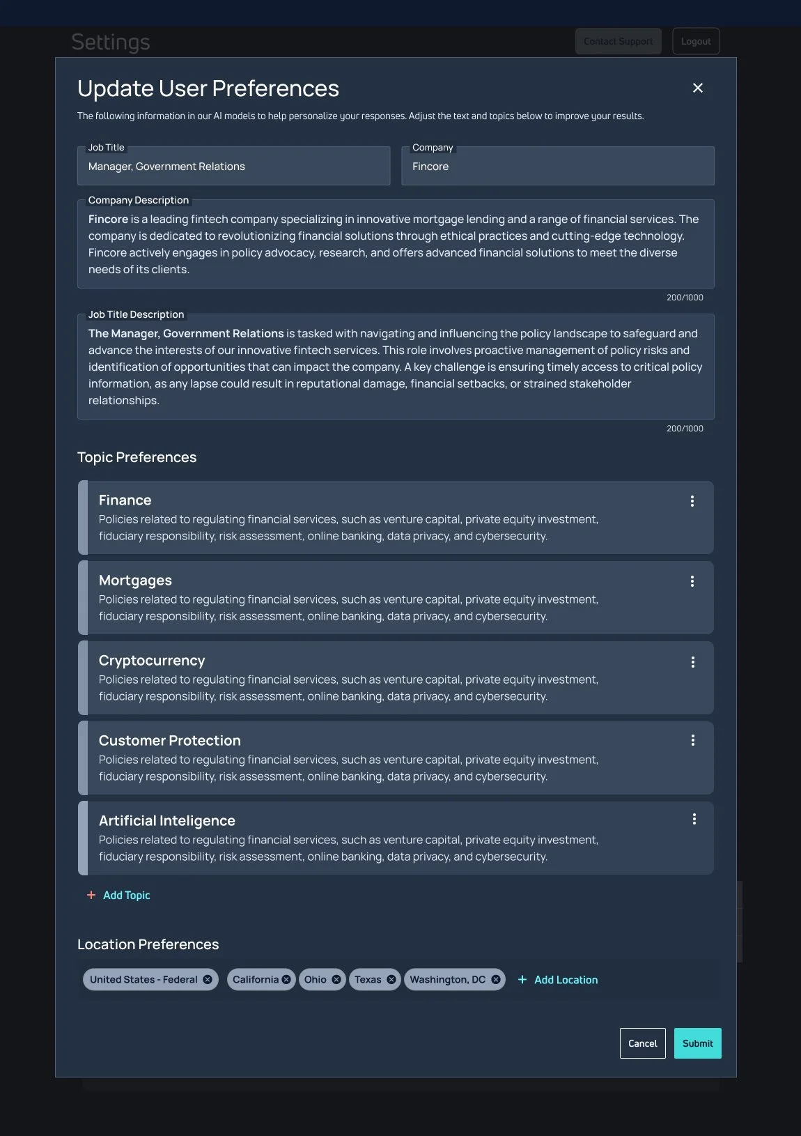
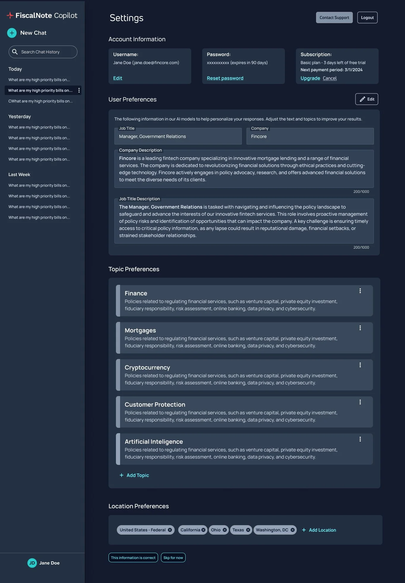
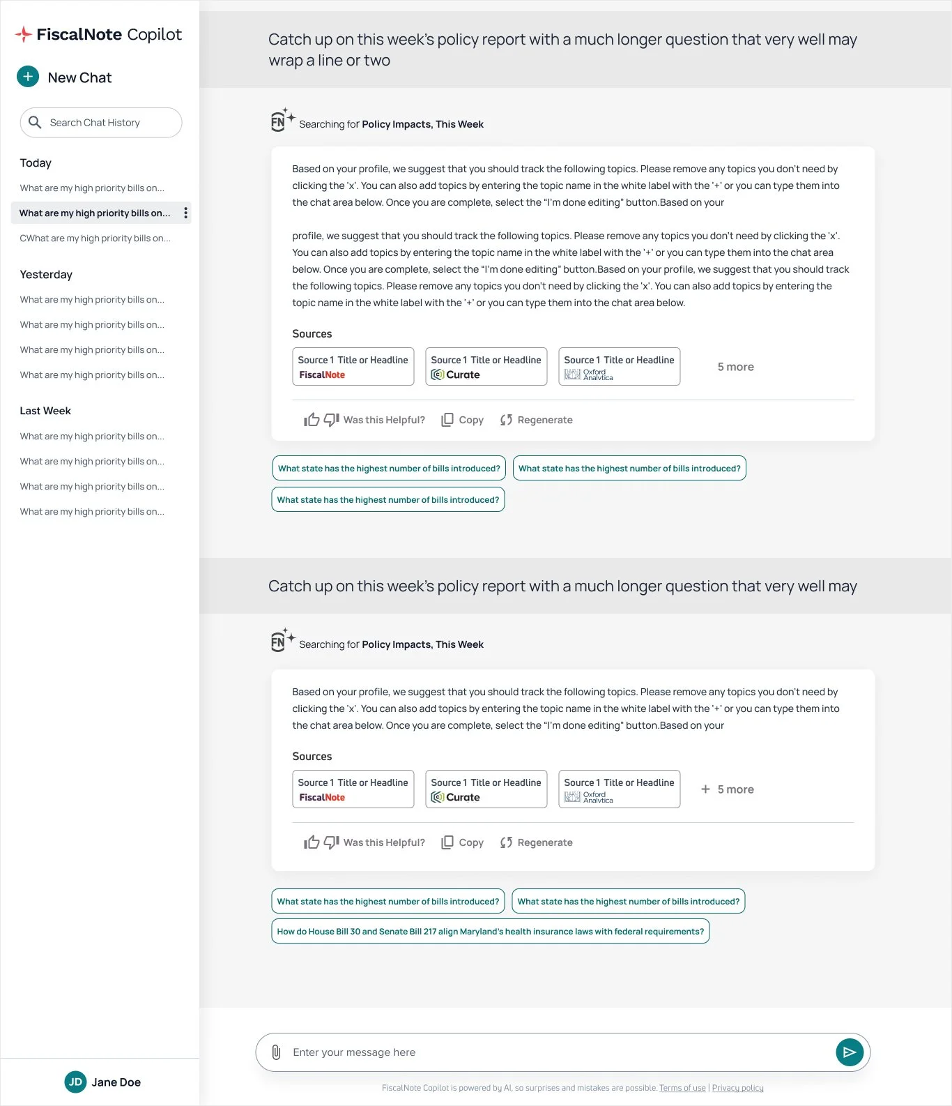
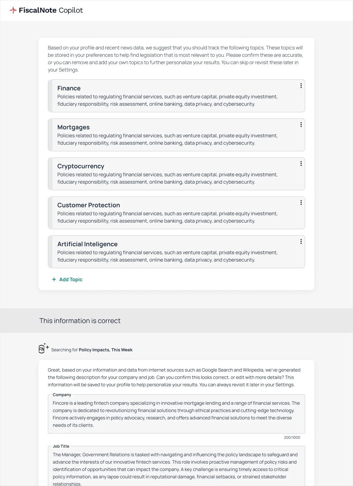
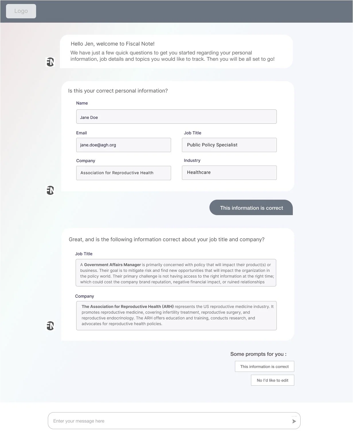
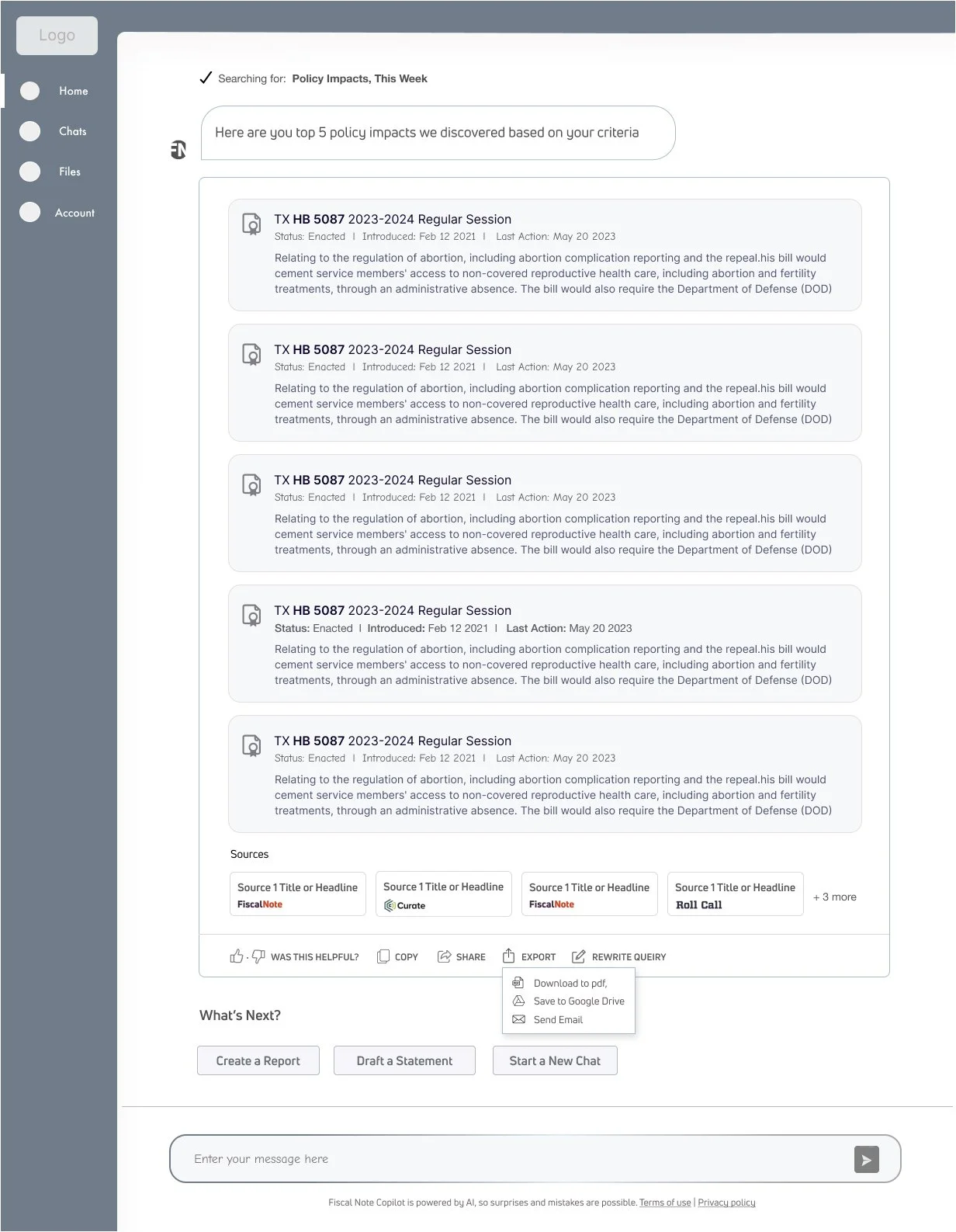
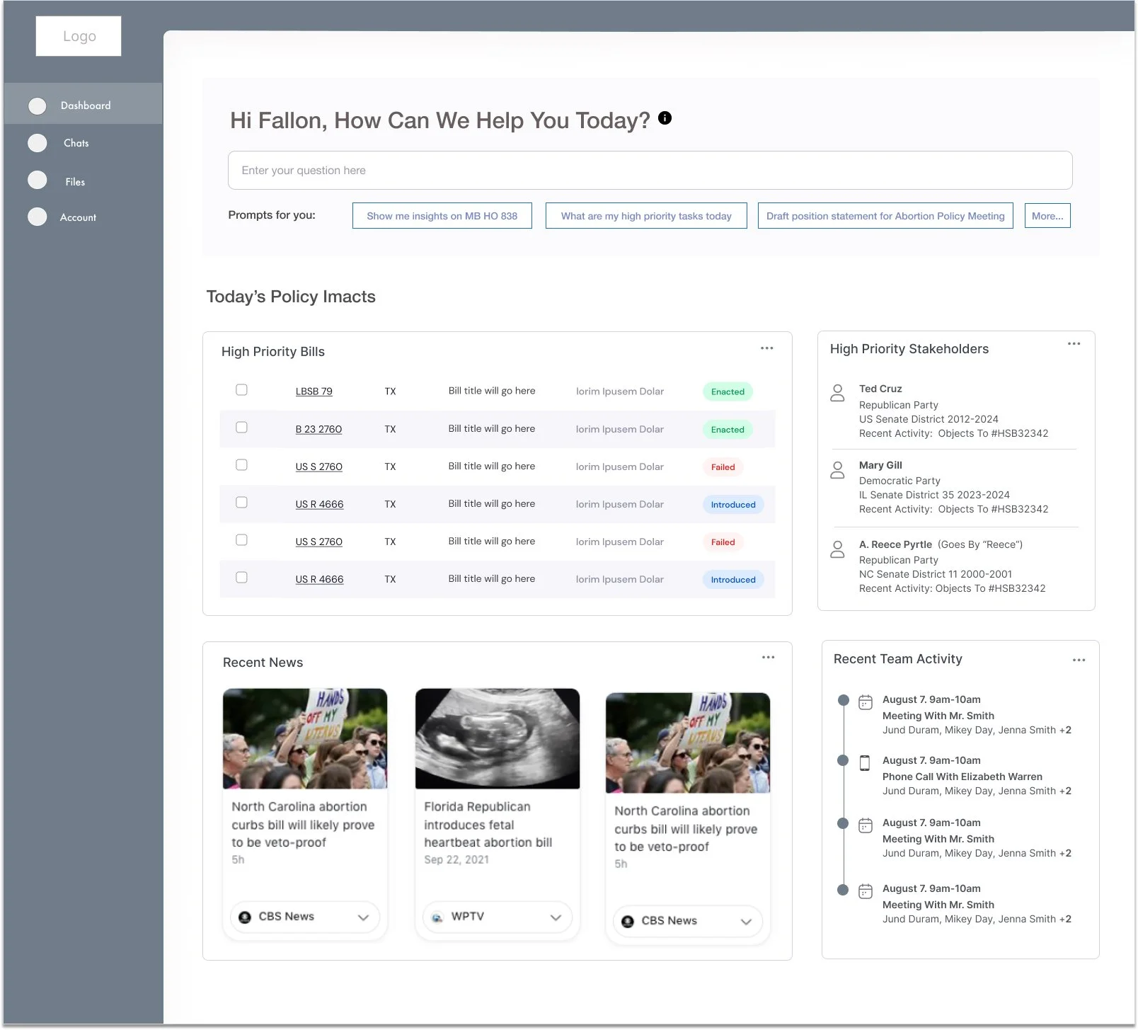
• Designed a product dashboard and determined the most valuable data and content to surface, giving clients a high-level overview of their tracked policies, key updates, and team activity at a glance
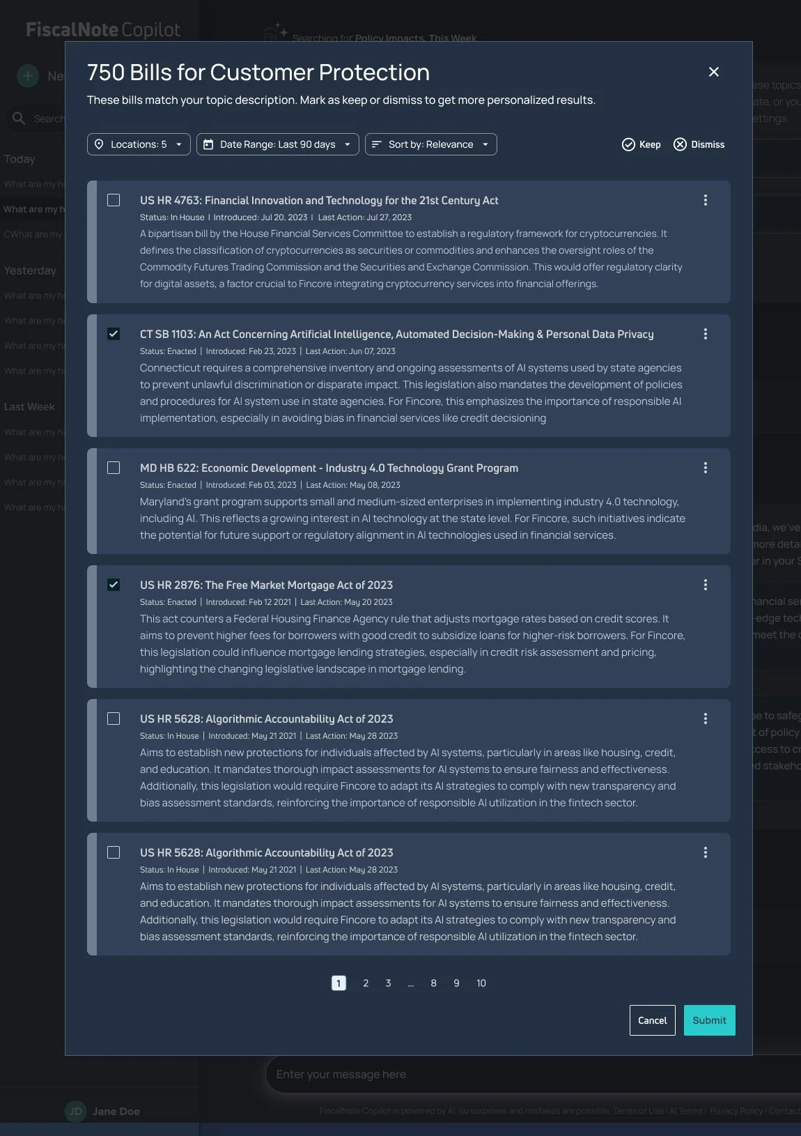
• Created and structured multiple report types (e.g., policy reports, committee reports, stakeholder reports, issue briefs)
• Developed solutions for partial or missing data scenarios, ensuring clarity and usability even with limited inputs
• Determined the most valuable data points and visualizations tailored to varied reporting goals
• Collaborated with the manager of data viz to help establish a new, scalable design system for charts and visuals
Collaboration & Delivery
• Worked closely with product managers and other key stakeholders including sales and client services
• Defined requirements, negotiated scope with engineers, and supported sprint execution
• Helped establish a new data visualization design system for consistent, scalable reporting
Outcome
The redesigned reporting experience was praised by both internal teams and clients for its clarity, flexibility, and visual polish. The new design direction positioned reporting as a more strategic product feature, and I received direct recognition from leadership for reviving and driving forward a complex, high-impact initiative.